Hi Annie-
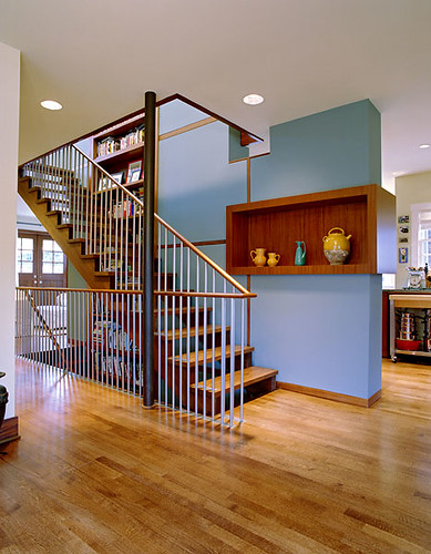
I am thrilled to be writing to you because I LOVE your blog, and I finally have a BIG problem I would love your help on! We built our home two years ago, and painted our fairly large, two-story living room Ralph Lauren Reisling, and my husband and I both detest the color.


We are finally going to have the room re-painted, and would love your opinion on a color.

It looks into both our dining room...

...and kitchen, which are green, and nutmeg colored, respectfully.

I am thinking some sort of brown, and as you can tell from the pictures, my swatches are not helping me.
Can you suggest a great color that will help me tie in the dining room and living room together? We will be putting a leather sofa in the living room, and it gets bright morning light.
I would greatly appreciate your expert opinion!! Thank you so much!
- Stefanie Bradshaw, Louisville, KY

Dear Stephanie:
Ahhh, Louisville. A city that is near and dear to my heart...when my husband and I were engaged, I visited him in Louisville, where he was working on a campaign. We stayed at the utterly charming Seelbach Hotel,

and a big wedding was happening there...the lieutenant governor and Miss Kentucky? Something like that. Royalty. Anyway, it was one of my favorite weekends of all time. It was there that I also met my future right hand at the Smithsonian, who sealed his fate by saying, upon meeting me, "I love your shoes!" Awesome town.
But back to your living room. BROWN IS WRONG. I understand the impulse to go darker after that anemic yellow (Ralph, don't go screwing up my favorite color, ok?), but darker is simply not consistent with the architectural intent of this soaring space.
Light, airy, open...these are the effects you want to preserve. Especially because the side rooms (the dining room and kitchen) are rich in color, let's keep the living room light and neutral. I know it sounds like a cop-out, but it's the space, not the color, that needs to do the talking here.
 Try to match the kitchen cabinets, but keep yellow out of it. This might mean you're looking at the very lightest taupes your paint manufacturer has to offer. In Benjamin Moore, take a look at Benjamin Moore's OC-35 Spanish White, shown on the innermost picture frame moulding
  below, or good old OC-17 White Dove, which is outside the picture frame moulding.
Either of them should look soft but NOT yellow; if it does, reject it. (Its feelings won't be hurt, I promise.)

In any other paint line, pick up swatches that look like your kitchen cabinets and see what works.
If it were me, and I had a free weekend (or a free few hundred bucks to pay someone else to do it), I'd also paint my banister and newel posts high-gloss black to emphasize the contrast between them and the walls. (Aren't the balusters black wrought iron?) But that's me.
I'd probably also change the ceiling fan to something white or silver so it doesn't draw attention to itself. But spend your time - and your money - on the walls first, and then see how you feel.
Thanks for the great question, Stephanie. This may not sound like an inspiring solution, but I guarantee you'll love the space when you banish the yellow. Keep us posted!
"Whites" photo from decorati.com, courtesy of xJavierx's photostream on Flickr.


 Try to match the kitchen cabinets, but keep yellow out of it. This might mean you're looking at the very lightest taupes your paint manufacturer has to offer. In Benjamin Moore, take a look at Benjamin Moore's OC-35 Spanish White, shown on the innermost picture frame moulding
  below, or good old OC-17 White Dove, which is outside the picture frame moulding.